ChartDirector Ver 3.1 (PHP Edition Edition)

Finance Chart (2)


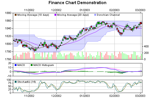
This example demonstrates combining various ChartDirector features to create full-featured finance charts. The chart in this example includes candlestick, moving averages, Donchian channel, volume data, MACD and Stochastic indicators. You may use techniques demonstrated in this example to create additional indicators of your choice.

This example assumes the source data comes from a database table with 6 columns for time stamp, high value, low value, open value, close value, and volume. These data are then used to devire additional indicators such as moving averages, Donchian channel, MACD and Stochastic.

For simplicity and to allow this example to run without connecting to a real database, a RanTable object is used to simulate the database table. RanTable is a ChartDirector utility class used for creating tables with random numbers.

Data Preparation

Overall Chart Design

Top Chart

Volume Chart

Middle Chart

Bottom Chart

Source Code Listing

[File: phpdemo/finance2.php".]
<?php require_once("../lib/phpchartdir.php"); #Create a finance chart demo containing 100 days of data $noOfDays = 100; #To compute moving averages, we need to get data points before the first day $extraDays = 30; #We use a random table to simulate the data from a database. The random table #contains 6 cols x (noOfDays + extraDays) rows, using 9 as the seed. $rantable = new RanTable(9, 6, $noOfDays + $extraDays); #Set the 1st col to be the timeStamp, starting from Sep 4, 2002, with each row #representing one day, and counting week days only (jump over Sat and Sun) $rantable->setDateCol(0, chartTime(2002, 9, 4), 86400, true); #Set the 2nd, 3rd, 4th and 5th columns to be high, low, open and close data. The #open value starts from 1800, and the daily change is random from -5 to 5. $rantable->setHLOCCols(1, 1800, -5, 5); #Set the 6th column as the vol data from 50 to 250 $rantable->setCol(5, 50, 250); #Now we read the data from the table into arrays $timeStamps = $rantable->getCol(0); $highData = $rantable->getCol(1); $lowData = $rantable->getCol(2); $openData = $rantable->getCol(3); $closeData = $rantable->getCol(4); $volData = $rantable->getCol(5); #To create the date labels for the x axis, we need to trim extraDays at the #beginning. Also, we select only the dates that represent the first date in the #month as labels. $selectDates = new ArrayMath($timeStamps); $selectDates->selectStartOfMonth(); $labels = array_slice($selectDates->result(), $extraDays); #Similarly, for the volume data, we need to trim extraDays at the beginning $volData = array_slice($volData, $extraDays); #========================================================================== # Create the top chart #========================================================================== #Create a XYChart object of size 600 x 210 pixels $c = new XYChart(600, 210, Transparent); #Set the plotarea at (50, 20) and of size 500 x 180 pixels. Enable both the #horizontal and vertical grids by setting their colors to grey (0xc0c0c0) $plotAreaObj = $c->setPlotArea(50, 20, 500, 180); $plotAreaObj->setGridColor(0xc0c0c0, 0xc0c0c0); #Add a horizontal legend box at (50, 15) and set its border and background #colors to transparent $legendObj = $c->addLegend(50, 15, false, "arial.ttf", 7.5); $legendObj->setBackground(Transparent); #Add a candle stick layer using green/red (0xff00/0xff0000) for up/down candles, #and with data gap set to 0 to maximize the candle width. We need to trim #extraDays at the beginning as these days are just for computing moving #averages. $candleStickLayerObj = $c->addCandleStickLayer(array_slice($highData, $extraDays ), array_slice($lowData, $extraDays), array_slice($openData, $extraDays), array_slice($closeData, $extraDays), 0xff00, 0xff0000); $candleStickLayerObj->setDataGap(0); #Add line layers representing 10 days and 20 days moving averages. $movAvgLine1 = new ArrayMath($closeData); $movAvgLine1->movAvg(10); $movAvgLine2 = new ArrayMath($closeData); $movAvgLine2->movAvg(20); $c->addLineLayer(array_slice($movAvgLine1->result(), $extraDays), 0x663300, "Moving Average (10 days)"); $c->addLineLayer(array_slice($movAvgLine2->result(), $extraDays), 0x9900ff, "Moving Average (20 days)"); #Donchian Channel is the zone between the maximum and minimum values in the last #20 days $upperBand = new ArrayMath($highData); $upperBand->movMax(20); $lowerBand = new ArrayMath($lowData); $lowerBand->movMin(20); #Add the upper and lower lines for the Donchian Channel $uLayer = $c->addLineLayer(array_slice($upperBand->result(), $extraDays), 0x9999ff, "Donchian Channel"); $lLayer = $c->addLineLayer(array_slice($lowerBand->result(), $extraDays), 0x9999ff); #Color the region between the bollinger lines with semi-transparent blue $c->addInterLineLayer($uLayer->getLine(), $lLayer->getLine(), 0xc06666ff); #Add labels to the x axis formatted as mm/yyyy $c->xAxis->setLabels2($labels, "{value|mm/yyyy}"); #For the top chart, the x axis is on top $c->setXAxisOnTop(); #========================================================================== # Create the volume chart (the bottom part of the top chart) #========================================================================== #Create a XYChart object of size 600 x 80 pixels $c2 = new XYChart(600, 80, Transparent); #Set the plotarea at (50, 10) and of size 500 x 50) pixels. Set the background, #border and grid colors to transparent $c2->setPlotArea(50, 10, 500, 50, Transparent, -1, Transparent, Transparent, Transparent); #Compute an array to represent the closing price changes $closeChange = new ArrayMath($closeData); $closeChange->delta(); $closeChange = array_slice($closeChange->result(), $extraDays); #Select the volume data for "up" days. An up day is a day where the closing #price is higher than the preivous day. Use the selected data for a green bar #layer. $upVol = new ArrayMath($volData); $upVol->selectGTZ($closeChange); $barLayerObj = $c2->addBarLayer($upVol->result(), 0x99ff99, "Vol (Up day)"); $barLayerObj->setBorderColor(Transparent); #Select the volume data for "down" days. An up day is a day where the closing #price is lower than the preivous day. Use the selected data for a red bar #layer. $downVol = new ArrayMath($volData); $downVol->selectLTZ($closeChange); $barLayerObj = $c2->addBarLayer($downVol->result(), 0xff9999, "Vol (Down day)"); $barLayerObj->setBorderColor(Transparent); #Select the volume data for days when closing prices are unchanged. Use the #selected data for a grey bar layer. $equalVol = new ArrayMath($volData); $equalVol->selectEQZ($closeChange); $barLayerObj = $c2->addBarLayer($equalVol->result(), 0xc0c0c0, "Vol (No change)" ); $barLayerObj->setBorderColor(Transparent); #Set the primary y-axis on the right side $c2->setYAxisOnRight(); #========================================================================== # Create the middle chart (MACD chart) #========================================================================== #Create a XYChart object of size 600 x 80 pixels $c3 = new XYChart(600, 80, Transparent); #Set the plotarea at (50, 10) and of size 500 x 50) pixels. Enable both the #horizontal and vertical grids by setting their colors to grey (0xc0c0c0) $plotAreaObj = $c3->setPlotArea(50, 10, 500, 50); $plotAreaObj->setGridColor(0xc0c0c0, 0xc0c0c0); #Add a horizontal legend box at (50, 5) and set its border and background colors #to transparent $legendObj = $c3->addLegend(50, 5, false, "arial.ttf", 7.5); $legendObj->setBackground(Transparent); #MACD is defined as the difference between 12 days and 26 days exponential #averages (decay factor = 0.15 and 0.075) $expAvg26 = new ArrayMath($closeData); $expAvg26->expAvg(0.075); $macd = new ArrayMath($closeData); $macd->expAvg(0.15); $macd->sub($expAvg26->result()); #Add the MACD line using blue (0xff) color $c3->addLineLayer(array_slice($macd->result(), $extraDays), 0xff, "MACD"); #MACD histogram is defined as the MACD minus its 9 days exponential average #(decay factor = 0.2) $macd9 = new ArrayMath($macd->result()); $macd9->expAvg(0.2); #Add the 9 days exponential average line using purple color (0xff00ff) $c3->addLineLayer(array_slice($macd9->result(), $extraDays), 0xff00ff); #Add MACD histogram as a bar layer using green color (0x8000). Set bar border to #transparent. $macd->sub($macd9->result()); $barLayerObj = $c3->addBarLayer(array_slice($macd->result(), $extraDays), 0x8000, "MACD Histogram"); $barLayerObj->setBorderColor(Transparent); #Add labels to the x axis. We do not really need the label text, so we set them #to transparent. We need the grid line associated the labels. $c3->xAxis->setLabels2($labels); $c3->xAxis->setColors(LineColor, Transparent); #========================================================================== # Create the bottom chart (Stochastic chart) #========================================================================== #Create a XYChart object of size 600 x 120 pixels $c4 = new XYChart(600, 120, Transparent); #Set the plotarea at (50, 10) and of size 500 x 50) pixels. Enable both the #horizontal and vertical grids by setting their colors to grey (0xc0c0c0) $plotAreaObj = $c4->setPlotArea(50, 10, 500, 50); $plotAreaObj->setGridColor(0xc0c0c0, 0xc0c0c0); #Add a horizontal legend box at (50, 5) and set its border and background colors #to transparent $legendObj = $c4->addLegend(50, 5, false, "arial.ttf", 7.5); $legendObj->setBackground(Transparent); #Stochastic is defined as (close - moving_low) / (moving_high - moving_low) x #100. We use 14 days as the period for moving computations. $movLow = new ArrayMath($lowData); $movLow->movMin(14); $movRange = new ArrayMath($highData); $movRange->movMax(14); $movRange->sub($movLow->result()); $stochastic = new ArrayMath($closeData); $stochastic->sub($movLow->result()); $stochastic->div($movRange->result()); $stochastic->mul(100); #Traditional, for fast Stochastic chart, we draw both the Stochastic line and #its 3 days moving average $c4->addLineLayer(array_slice($stochastic->result(), $extraDays), 0x6060, "Stochastic (14)"); $stochastic->movAvg(3); $c4->addLineLayer(array_slice($stochastic->result(), $extraDays), 0x606000); #Set the y axis scale as 0 - 100, with ticks every 25 units $c4->yAxis->setLinearScale(0, 100, 25); #Add labels to the x axis formatted as mm/yyyy $c4->xAxis->setLabels2($labels, "{value|mm/yyyy}"); #We need to explicitly set the indent mode axis. By default, line layers are not #indented, but we need it to be indented so the x axis will synchronize with the #top and middle charts $c4->xAxis->setIndent(true); #========================================================================== # Combine the charts together using a MultiChart #========================================================================== #Create a MultiChart object of size 600 x 400 pixels $m = new MultiChart(600, 400); #Add a title to the chart $m->addTitle("Finance Chart Demonstration"); #Add the 4 charts to the multi-chart $m->addChart(0, 170, $c2); $m->addChart(0, 30, $c); $m->addChart(0, 235, $c3); $m->addChart(0, 300, $c4); #output the chart header("Content-type: image/png"); print($m->makeChart2(PNG)); ?>