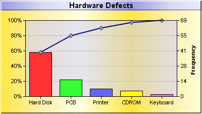
A pareto chart is a bar chart with the data sorted in descending order, together with a line chart showing the same data in accumulated form. In the current example, the data is shown as both percentages and value on the two y-axes.
The chart in this example is composed of two layers - a
BarLayer added using
XYChart.addBarLayer, and a
LineLayer added using
XYChart.addLineLayer.
This example employs the
ArrayMath object for computing the accumulated line, obtaining the scaling factor between the two y-axes, and re-scaling the line data as percentages.
The two y-axes are synchronized using
XYChart.syncYAxis.
[File: phpdemo/pareto.php".]
| <?php
require_once("../lib/phpchartdir.php");
#The data for the chart
$data = array(40, 15, 7, 5, 2);
#The labels for the chart
$labels = array("Hard Disk", "PCB", "Printer", "CDROM", "Keyboard");
#Create a XYChart object of size 400 x 225 pixels
$c = new XYChart(400, 225);
#Set the background color of the chart to gold (goldGradient). Use a 2 pixel 3D
#border.
$c->setBackground($c->gradientColor($goldGradient), -1, 2);
#Add a title box using 11 point Arial Bold font. Set the background color to
#blue metallic (blueMetalGradient). Use a 1 pixel 3D border.
$titleObj = $c->addTitle("Hardware Defects", "arialbd.ttf", 11);
$titleObj->setBackground($c->gradientColor($blueMetalGradient), -1, 1);
#Set the plotarea at (50, 40) and of 300 x 150 pixels in size. Use 0x80ccccff as
#the background color.
$c->setPlotArea(50, 40, 300, 150, 0x80ccccff);
#Add a line layer for the pareto line
$lineLayer = $c->addLineLayer();
#Compute the pareto line by accumulating the data
$lineData = new ArrayMath($data);
$lineData->acc();
#Set a scaling factor such as the maximum point of the line is scaled to 100
$scaleFactor = 100 / $lineData->max();
$lineData->mul2($scaleFactor);
#Add the pareto line using the scaled data. Use deep blue (0x80) as the line
#color, with light blue (0x9999ff) diamond symbols
$dataSetObj = $lineLayer->addDataSet($lineData->result(), 0x80);
$dataSetObj->setDataSymbol(DiamondSymbol, 9, 0x9999ff);
#Set the line width to 2 pixel
$lineLayer->setLineWidth(2);
#Add a multi-color bar layer using the given data. Bind the layer to the
#secondary (right) y-axis.
$barLayer3Obj = $c->addBarLayer3($data);
$barLayer3Obj->setUseYAxis2();
#Set the x axis labels using the given labels
$c->xAxis->setLabels($labels);
#Set the primary y-axis scale as 0 - 100 with a tick every 20 units
$c->yAxis->setLinearScale(0, 100, 20);
#Set the label format of the y-axis label to include a percentage sign
$c->yAxis->setLabelFormat("{value}%");
#Add a title to the secondary y-axis
$yAxis2Obj = $c->yAxis2();
$yAxis2Obj->setTitle("Frequency");
#Set the secondary y-axis label foramt to show no decimal point
$yAxis2Obj = $c->yAxis2();
$yAxis2Obj->setLabelFormat("{value|0}");
#Set the relationship between the two y-axes, which only differ by a scaling
#factor
$c->syncYAxis(1 / $scaleFactor);
#Output the chart
header("Content-type: image/png");
print($c->makeChart2(PNG));
?> |
© 2004 Advanced Software Engineering Limited. All rights reserved.