In the above chart, there are a number of small sectors. ChartDirector automatically moves the sector labels up and down to avoid overlapping.
This example demonstrates a technique that can improve sector label layout by adjusting the start angle of the first sector using
PieChart.setStartAngle.
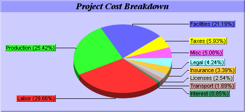
One common issue in pie charts is if they contain a lot of small sectors, and the data are sorted (which is quite common in pie charts), the small sectors will be crowded together instead of distributed evenly or randomly.
The side layout method can avoid label overlapping by moving the labels up and down. However, if there are too many small sectors crowded at the top or bottom of the pie, some labels may need to be moved great distances.
In these cases, label layout can often be improved (that is, labels distributed more evenly, and moved less from their original positions) by choosing an appropriate start angle for the first sector. The objective is to ensure the small sectors are crowded at the left or right side of the pie instead of at the top or bottom.
For example, if the data is in descending order (small sectors at the end), you may use a start angle of 135 degrees with clockwise sector layout. In this case, the small sectors at the end will be at the right side of the pie.
Similarly, if the data is in ascending order (small sectors at the beginning), you may use a start angle of 45 degrees with clockwise sector layout. This will position the small sectors at the right side of the pie.
[File: phpdemo/smallsectorpie.php".]
| <?php
require_once("../lib/phpchartdir.php");
#The data for the pie chart
$data = array(35, 30, 25, 7, 6, 5, 4, 3, 2, 1);
#The labels for the pie chart
$labels = array("Labor", "Production", "Facilities", "Taxes", "Misc", "Legal",
"Insurance", "Licenses", "Transport", "Interest");
#Create a PieChart object of size 500 x 230 pixels, with a light blue (0xccccff)
#background and a 1 pixel 3D border
$c = new PieChart(500, 230, 0xccccff, -1, 1);
#Add a title box using Times Bold Italic/14 points as font and 0x9999ff as
#background color
$titleObj = $c->addTitle("Project Cost Breakdown", "timesbi.ttf", 14);
$titleObj->setBackground(0x9999ff);
#Set the center of the pie at (250, 120) and the radius to 100 pixels
$c->setPieSize(250, 120, 100);
#Draw the pie in 3D
$c->set3D();
#Use the side label layout method
$c->setLabelLayout(SideLayout);
#Set the label box the same color as the sector with a 1 pixel 3D border
$labelStyleObj = $c->setLabelStyle();
$labelStyleObj->setBackground(SameAsMainColor, Transparent, 1);
#Set the border color of the sector the same color as the fill color. Set the
#line color of the join line to black (0x0)
$c->setLineColor(SameAsMainColor, 0x0);
#Set the start angle to 135 degrees may improve layout when there are many small
#sectors at the end of the data array (that is, data sorted in descending
#order). It is because this makes the small sectors position near the horizontal
#axis, where the text label has the least tendency to overlap. For data sorted
#in ascending order, a start angle of 45 degrees can be used instead.
$c->setStartAngle(135);
#Set the pie data and the pie labels
$c->setData($data, $labels);
#output the chart
header("Content-type: image/png");
print($c->makeChart2(PNG));
?> |
© 2004 Advanced Software Engineering Limited. All rights reserved.