ChartDirector Ver 3.1 (PHP Edition Edition)

General Curve Fitting


In linear regression, the underlying relationship among the data points is assumed to be a straight line.

However, in many applications, the underlying relationship cannot be assumed to be a straight. It can be quadratic, cubic, exponential, logarithmic, guassian, sinusoidal, etc. In many cases, the underlying relationship is unknown.

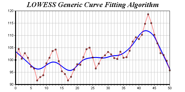
To solve this kind of problems, ChartDirector supports a general curve fitting algorithm known as LOWESS using ArrayMath.lowess and ArrayMath.lowess2.

LOWESS works by assuming a small segment of any curve can be approximated by a straight line. For each data point, LOWESS performs a weighted linear regression using nearby points. It then adjusts the data point using the result of the linear regression. The adjusted data points should form a smooth curve reflecting the underlying relationship. For further details, please refer to ArrayMath.lowess.

In this example, the adjusted data points are joined together with a spline layer using XYChart.addSplineLayer.

Source Code Listing

[File: phpdemo/curvefitting.php".]
<?php require_once("../lib/phpchartdir.php"); #Use random table to generate a random series. The random table is set to 1 col #x 51 rows, with 9 as the seed $rantable = new RanTable(9, 1, 51); #Set the 1st column to start from 100, with changes between rows from -5 to +5 $rantable->setCol(0, 100, -5, 5); #Get the 1st column of the random table as the data set $data = $rantable->getCol(0); #Create a XYChart object of size 600 x 300 pixels $c = new XYChart(600, 300); #Set the plotarea at (50, 35) and of size 500 x 240 pixels. Enable both the #horizontal and vertical grids by setting their colors to grey (0xc0c0c0) $plotAreaObj = $c->setPlotArea(50, 35, 500, 240); $plotAreaObj->setGridColor(0xc0c0c0, 0xc0c0c0); #Add a title to the chart using 18 point Times Bold Itatic font. $c->addTitle("LOWESS Generic Curve Fitting Algorithm", "timesbi.ttf", 18); #Set the y axis line width to 3 pixels $c->yAxis->setWidth(3); #Add a title to the x axis using 12 pts Arial Bold Italic font $c->xAxis->setTitle("Server Load (TPS)", "arialbi.ttf", 12); #Set the x axis line width to 3 pixels $c->xAxis->setWidth(3); #Set the x axis scale from 0 - 50, with major tick every 5 units and minor tick #every 1 unit $c->xAxis->setLinearScale(0, 50, 5, 1); #Add a blue layer to the chart $layer = $c->addLineLayer2(); #Add a red (0x80ff0000) data set to the chart with square symbols $dataSetObj = $layer->addDataSet($data, 0x80ff0000); $dataSetObj->setDataSymbol(SquareSymbol); #Set the line width to 2 pixels $layer->setLineWidth(2); #Use lowess for curve fitting, and plot the fitted data using a spline layer #with line width set to 3 pixels $curve = new ArrayMath($data); $curve->lowess(); $splineLayerObj = $c->addSplineLayer($curve->result(), 0xff); $splineLayerObj->setLineWidth(3); #Set zero affinity to 0 to make sure the line is displayed in the most detail #scale $c->yAxis->setAutoScale(0, 0, 0); #output the chart header("Content-type: image/png"); print($c->makeChart2(PNG)); ?>


width to 3 pixels $trendLayer->setLineWidth(3); #Add a 95% confidence band for the line $trendLayer->addConfidenceBand(0.95, 0x806666ff); #Add a 95% confidence band (prediction band) for the points $trendLayer->addPredictionBand(0.95, 0x8066ff66); #Add a legend box at (50, 30) (top of the chart) with horizontal layout. Use 10 #pts Arial Bold Italic font. Set the background and border color to Transparent. $legendBox = $c->addLegend(50, 30, false, "arialbi.ttf", 10); $legendBox->setBackground(Transparent); #Add entries to the legend box $legendBox->addKey("95% Line Confidence", 0x806666ff); $legendBox->addKey("95% Point Confidence", 0x8066ff66); #Display the trend line parameters as a text table formatted using CDML $textbox = $c->addText(56, 65, sprintf( "<*block*>Slope\nIntercept\nCorrelation\nStd Error<*/*> <*block*>%.4f ". "sec/tps\n%.4f sec\n%.4f\n%.4f sec<*/*>", $trendLayer->getSlope(), $trendLayer->getIntercept(), $trendLayer->getCorrelation(), $trendLayer->getStdError()), "arialbd.ttf", 8); #Set the background of the text box to light grey, with a black border, and 1 #pixel 3D border $textbox->setBackground(0xc0c0c0, 0, 1); #output the chart header("Content-type: image/png"); print($c->makeChart2(PNG)); ?>

color that switches on and off periodically. When used to draw a line, the line will appear as a dash line.

Dash line colors are created using BaseChart.dashLineColor and DrawArea.dashLineColor. They accept a line color and a dash pattern code as arguments, and return a 32-bit integer acting as a handle to the dash line color. The handle can be used in any ChartDirector API that expects a color as its input.

Palette Colors

Palette colors are colors of the format FFFFnnnn, where the least significant 16 bits (nnnn) are the index to the palette. A palette is simply an array of colors. For a palette color, the actual color is obtained by looking up the palette using the index. For example, the color FFFF0001 is the second color in the palette (first color is index 0).

The colors in the palette can be ARGB colors or "dynamic" colors (pattern, gradient and dash line colors).

The first eight palette colors have special significance. The first three palette colors are the background color, default line color, and default text color of the chart. The 4th to 7th palette colors are reserved for future use. The 8th color is a special dynamic color that is equal to the data color of the "current data set".

The 9th color (index = 8) onwards are used for automatic data colors. For example, in a pie chart, if the sector colors are not specified, ChartDirector will automatically use the 9th color for the first sector, the 10th color for the second sector, and so on. Similarly, for a multi-line chart, if the line colors are not specified, ChartDirector will use the 9th color for the first line, the 10th color for the second line, and so on.

The ChartDirector API pre-defines several constants to facilitate using palette colors.

ConstantValueDescription
PaletteFFFF0000 The starting point of the palette. The first palette color is (Palette + 0). The nth palette color is (Palette + n - 1).
BackgroundColorFFFF0000The background color.
LineColorFFFF0001The default line color.
TextColorFFFF0002The default text color.
[Reserved]FFFF0003 - FFFF0006 These palette positions are reserved. Future versions of ChartDirector may use these palette positions for colors that have special significance.
SameAsMainColorFFFF0007A dynamic color that is equal to the data color of the current data set. This color is useful for objects that are associated with data sets. For example, in a pie chart, if the sector label background color is SameAsMainColor, its color will be the same as the corresponding sector color.
DataColorFFFF0008The starting point for the automatic data color allocation.

When a chart is created, it has a default palette. You may modify the palette using BaseChart.setColor, BaseChart.setColors, or BaseChart.setColors2.

The advantages of using palette colors are that you can change the color schemes of the chart in one place. ChartDirector comes with several built-in palettes represented by the following pre-defined constants.

ConstantDescription
defaultPalette An array of colors representing the default palette. This palette is designed for drawing charts on white backgrounds (or lightly colored backgrounds).
whiteOnBlackPalette An array of colors useful for drawing charts on black backgrounds (or darkly colored backgrounds).
transparentPalette An array of colors useful drawing charts on white backgrounds (or lightly colored backgrounds). The data colors in this palette are all semi-transparent.


'712', '784');